The secrets behind good fonts
Table of contents
- Table of contents
- Legibility or readability?
- Why is a good legibility and clear font important?
- Examples for fonts with good readability
- How we read
- General rules for fonts
- Summing up - a good font
- Further reading
Legibility or readability?
When it comes to styling a font, legibility and readability play a big role.
But first, we need to differentiate legibility and readability. Legibility relates to the ability to tell one letter apart from another in a font. Readability is about how the reader can decipher and make meaning of text.
Why is a good legibility and clear font important?
If not well-defined, a font can cause confusion, for example when writing similar-looking letters.
There was a study by Thomas Bohm, showed that the letters and symbols below were confusing for people aged 13 to 45 with no dyslexia or visual impairments.
- clear / dear
- turn / tum
- CS5 / CSS
- 105 / IOS
- 5AM / SAM
- Z2 / 22
- LJ, LI, Ll / U
- ce / oe
When the user age increases to over 45 or the user has a visual impairment, the list of characters that may be confused expands:
- i / j
- B / 8
- D / O, 0, o
- 0 / O, o
- k / R
- a / o
- F / f
- r / v / Y
- g / q
Similar shaped letters can be very confusing. I can totally comprehend why also people without visual impairment confuse these letters when reading, particularly when reading fast.
GOV.UK for example avoids using certain characters in passcodes altogether because of these legibility issues.
Examples for fonts with good readability
In general, when picking a font that is good for reading, you want to consider the legibility.
According to the Bureau of Internet Accessibility, the best fonts for web accessibility are Times New Roman, which is the default for print and web documents, Verdana and Arial. Arial is a sans-serif font, especially featuring natural strokes and thus an organic look. The list continues with Tahoma, Helvetica and Calibri. The latter is featured as a very easy-to-read font.
All the mentioned fonts are simple, basic and do not have any kind of extra decoration, avoiding confusion for readers on computer screens. You also may know them, as they are popular typefaces.
How we read
How the human eye sees text and read
Reading is very complicated. The experience of reading is shaped by the reader’s surroundings, availability or distraction, his needs (e.g. when looking for something specific) and more. But not only external influences affect our reading ability, of course our eyes and brain affect the latter.
Starting off, humans do not read linear. The human eyes perform a series of back and forth movements, saccades, or quick hops across a line of text (fig 1.1). The size of the hops can variate and depends on one’s reading expertise and the familiarity with the text’s topic. Saccades are helping the human eyes recognizing a lot of information in a short time span.
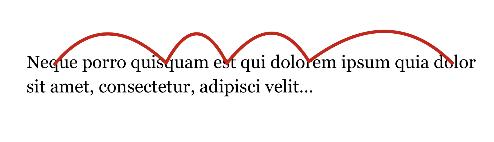
Between saccades, the human eyes perform a stop, called a fixation (fig 1.2). During these fixations, the eyes see some letters clearly, while the rest blurs out.
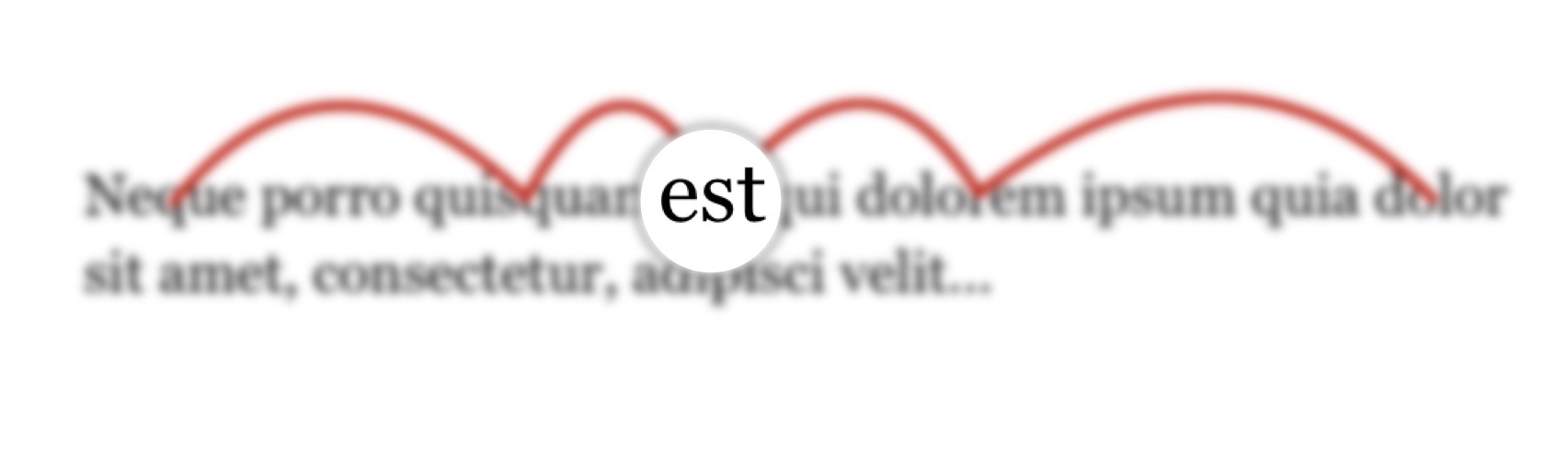
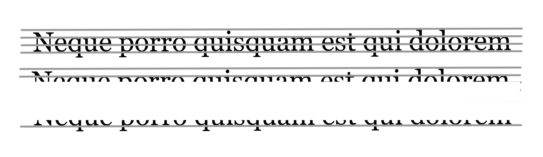
Moving on, the critical information our eyes see is in the tops of letters
What the science says
Some studies show that humans read the shapes of words, some say that humans decipher words letter by letter.
But most studies agree that the ease of reading relies on the visual feel and on the ease of differentiating characters from each other.
Humans recognize words by the shapes they form, mixed-case text with irregular shapes and height lets humans identify words easier.
General rules for fonts
The American Psychological Association state these general rules for fonts in their style guidelines for accessibile typography:
- Letter forms should be similar to content expectation
- No double-decker “g”
- Substantially different capital “I” and lowercase “L”, capital “O” and “0”
- Distinction between “p”, “q”, “d” and “b”, even if rotated of mirrored
- Large periods (and commas, etc.)
- Relatively large ratio of lowercase x-height vs. Capital x-height
- Built-in kerning
Summing up - a good font
Summing up, a good font has:
- A large lowercase x-height and a large ratio to capital x-height
- A different capital “i” and lowercase “l” (height difference), capital “O” and “0”; “p”, “q”, “d” and “b” (avoid same characters when rotating / mirroring) and general distinguishable characters
- Different character heights in general (character shape)
→ All characters featured in a font are different.
- No double-decker “g”
- Large periods, commas, etc.
- Good built-in kerning
- Natural strokes (as featured in Arial)
In general a font is simple, natural, avoids irrelevant decoration and thus irritation / confusion.